Modern Coffee Station Ideas: Minimalist Setups That Work
Search "modern coffee station" and you get a lot of white counters with three objects on them. It looks calm because there is nothing there - which is not a design approach so much as an empty kitchen.
The stations that actually work are more interesting than that. They usually hold the same amount of equipment as a cluttered one. The difference is how much of it is visible at once, and how tightly the materials are controlled.
Here is what genuinely produces the look, in order of how much difference each one makes.
1. Material discipline does most of the work
This is the lever almost nobody pulls, and it matters more than any single object you could buy.
Pick two materials and hold the line. Matte black and pale wood. Stainless and white ceramic. Warm grey and oak. Every item on the station - tray, canisters, mugs, organizer - comes from those two families.
The reason it works is that visual noise on a small surface comes mostly from material variety, not from item count. Eight objects in two materials read as a set. Four objects in four materials read as a pile.
2. Hide the things that were never going to be beautiful
Every coffee station has ugly-but-necessary components. Modern stations do not own fewer of them; they just do not display them.
- Packaging. Bags with clips, pod boxes, sugar sachets. Decant into matching canisters and this alone transforms the corner.
- Backup stock. One week out, the rest behind a door. Our organizer guide covers the containers that make this painless.
- The mug collection. Four matching mugs visible, the mismatched ones in a cupboard. A modern station is where a mug collection goes to be edited.
- Cords. The most overlooked item on this list - see below.
3. The cord problem
A carefully styled station with a tangle of black cable behind it never quite reads as designed, and this is the detail that separates the stations in photographs from the ones in real kitchens.
- Adhesive cable clips along the back edge of the counter, running cords in one straight line rather than a loop.
- Shorten the slack. Do not coil it into a visible bundle - route it and secure it.
- A cord box if a multi-plug is involved. About $15, and it removes the single ugliest object in most coffee corners.
- Choose the outlet first. Placing the station where the cord run is shortest is free, and it is easier than hiding a long one afterwards.
4. Leave space, deliberately
Negative space is the actual design element in minimalism, and it is the hardest one to keep, because empty counter invites things to be put on it.
A practical rule: whatever surface the station occupies, leave roughly a third of it genuinely empty - and treat that third as part of the design rather than as unused space waiting for something. It is also the working area where you actually make coffee, so it earns its keep twice.
Three modern directions
"Modern" covers several distinct looks. Pick one rather than blending them.
| Look | Materials | Machine | Accent |
|---|---|---|---|
| Scandinavian minimal | White + pale oak | Stainless or white, simple silhouette | One plant, nothing else |
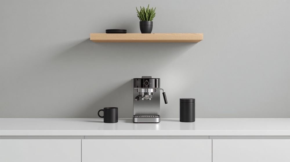
| Matte contemporary | Matte black + stainless | Black espresso machine | Warm under-shelf lighting |
| Warm modern | Warm grey + walnut | Stainless with wood accents | Stone or concrete tray |
All three share the same discipline: two materials, hidden supplies, real empty space. Only the palette changes.
Gear that suits the look
Shape and finish matter more than features here, since the machine is the largest visible object and effectively sets the palette.
- Simple silhouettes. Machines with clean lines and few visible controls suit this far better than ones with busy button panels and large printed logos.
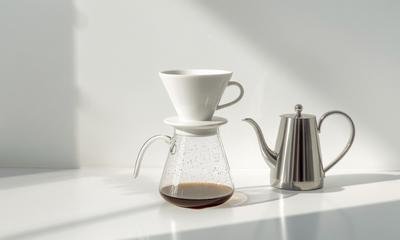
- Manual brewing is the most minimal option. A dripper, a stainless gooseneck kettle and a hand grinder pack away entirely - our V60 vs Chemex vs French press comparison covers which suits your mornings, and a glass brewer is close to invisible on a counter.
- Slim espresso machines if you want espresso without the bulk; the compact picks are flagged in our beginner espresso machine guide.
- A stone or concrete tray instead of wood, if you want the harder-edged version of the look.
- Matching mugs in one finish - the fastest way to make a mixed collection stop fighting the palette.
Lighting, which most minimal stations get wrong
Minimal palettes are heavily dependent on light quality, because there is little colour to carry the room. Cool white light makes a grey-and-oak station look clinical rather than calm.
Warm-white under-cabinet lighting is the fix, and on a matte black station it is close to essential - dark palettes absorb light and go flat without it. This is one of the few cases where the lighting choice does more than any object on the counter.
Modern on a small counter
Minimalism and small spaces suit each other, since both reward editing. Two adjustments:
- Go vertical with a single floating shelf in the same wood as the tray. One shelf, two or three items, plenty of gaps.
- Skip the tray if the counter is very tight and let the machine and canister sit directly on the surface - at small scale, a tray can read as another object rather than a boundary.
Our kitchen counter coffee station guide covers the layouts, and the apartment coffee corner guide handles the renter-friendly version.
What to skip
- Minimalist decor. A minimal-styled sign is still an object on a surface. Buying decor to look like you own less is the contradiction at the centre of most "minimalist" shopping lists.
- All-white everything. Without a second material it reads as clinical rather than calm. White plus one wood or one metal is the version that works.
- Open shelving for supplies you use daily. It looks good empty and rarely stays that way. Display the things worth displaying; hide the rest behind a door.
- Three or more accent colours. Two is calm. Three is decoration.
- Hiding the things you use every morning. The fastest way for a minimal station to fill up again is making daily items inconvenient - they migrate back onto the counter within a fortnight and stay there.
Where to start
In order of impact: decant into matching canisters, cut the visible mugs to four, clip the cords, and take one thing away without replacing it. That sequence costs under $40 and does more than any purchase would.
For the wider styling principles, our coffee bar decor guide covers the contain-then-decorate order this whole approach depends on, and the essentials checklist settles what actually deserves counter space. Building from scratch? The step-by-step guide walks the whole thing through. And if you find the minimal look a little cold, the farmhouse coffee bar guide is the warm end of the same spectrum.
Frequently asked questions
What makes a coffee station look modern?
Three things, and none of them is buying modern-looking decor. Keep the materials to two - say matte black and pale wood, or stainless and white. Hide anything that isn't beautiful, especially cords and packaging. And leave genuine empty space around what's left. Modern reads as restraint far more than it reads as any particular object.
How do I make a minimalist coffee bar?
Decant everything out of its packaging, cut the visible mugs to four or fewer, put the daily supplies behind a door or in a matching container, and stop there. Minimalist is not about owning less coffee gear - it's about how much of it is visible at once. Most minimalist stations own exactly what a cluttered one owns.
What colour should a modern coffee station be?
Pick one neutral base and one accent, then stay disciplined. All-white with pale wood reads Scandinavian, matte black with stainless reads contemporary, and warm grey with oak sits between the two. Trouble starts at the third colour - two is calm, three usually isn't.
How do I hide the cords on my coffee bar?
Adhesive cable clips along the back edge of the counter, a cord box if there's a multi-plug involved, and shortening the slack rather than coiling it into a visible loop. Cords are the single most overlooked thing on modern stations - a beautifully styled corner with a tangle behind it never quite looks right, and it's a $10 fix.
Is a minimalist coffee station practical every day?
It is if you keep daily items reachable and hide only the backups. It stops being practical when things you use every morning live behind a cupboard door - that's when the station quietly migrates back onto the counter within a fortnight. Hide the spare beans, not the ones you're using.
What coffee maker suits a minimalist kitchen?
Anything with a simple silhouette and few visible controls. Slim espresso machines, stainless pour-over setups and plain glass brewers all suit the look, while machines with large printed logos and busy button panels fight it. Manual brewers are the most minimal option of all, since they pack away completely.